Project Overview
Being one of the leading travel booking platforms in the world, Booking.com offers a wide range of accommodations worldwide, including hotels, apartments, and unique stays. After assessing Booking.com's accommodation booking experience through research and interviews, I found several areas that were lacking. Therefore, I took this opportunity to improve Booking.com's accommodation booking experience, while staying true to it's brand image.
Project Type
Desktop website - Self-initiated redesign
My Role
UI/UX Designer
Scope of Work
User research, User testing, UI/UX design, Mockups, Prototyping
PROBLEM DISCOVERY
User Research
User Interviews
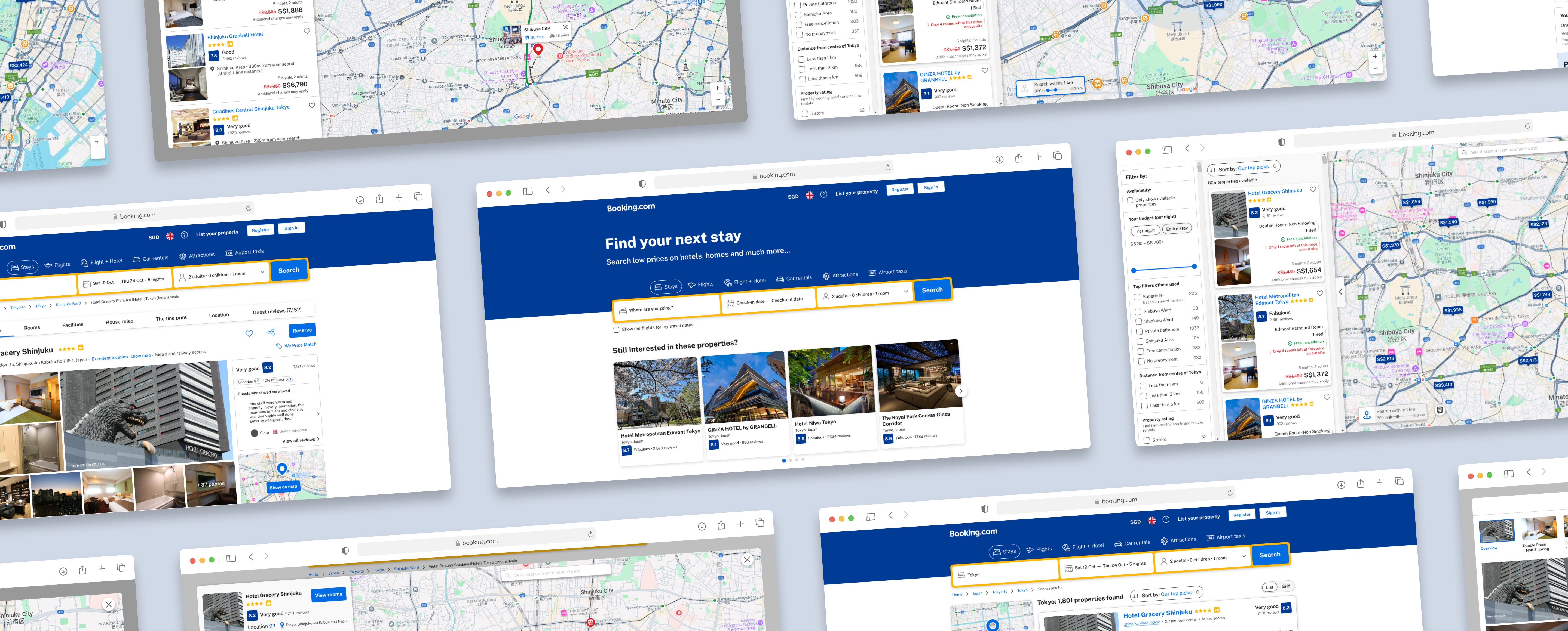
Through interviews, users have common consensus that the map search feature on the property browsing page was useful. However, when using the map feature on the selected property page, there were several issues faced due to the lack of focus on the selected property.
01
Due to this lack of information, it causes users the need to do more steps to research for their consideration.
02
As the map emphasized on browsing other properties, it makes it difficult for users that want to prioritize the current selected property to browse more in-depth on the surroundings.
03
As the properties that were unavailable were shown as well, the map is quite crowded and makes it slightly difficult for the user to focus on the available properties.
Market and Competitive Analysis
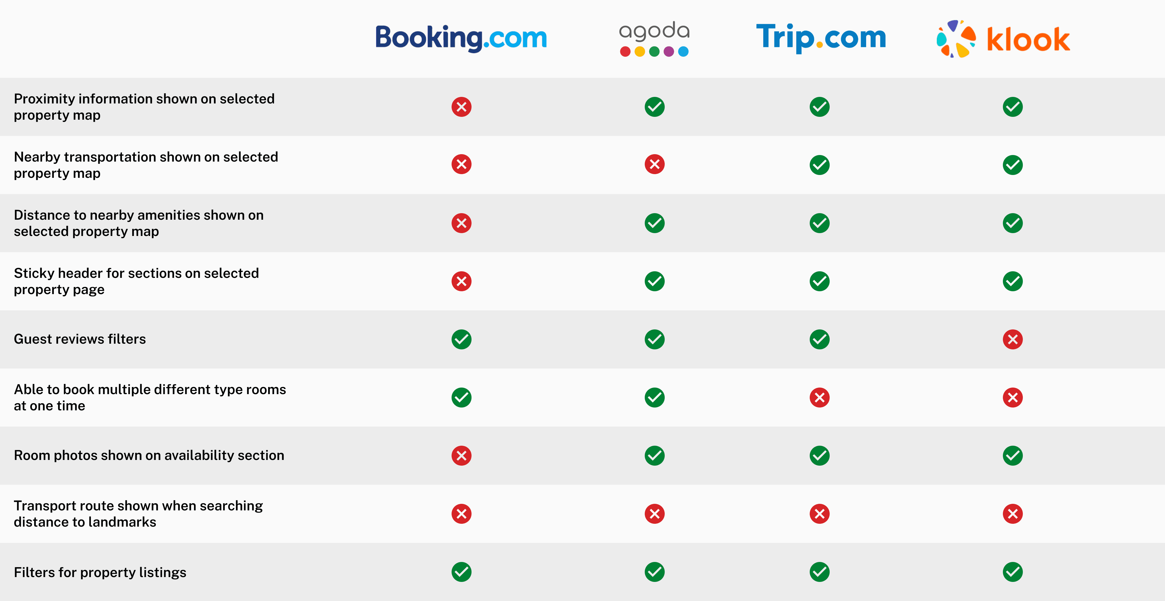
Competitive Analysis Summary
The main strength of booking.com is it’s simplistic UI and straight forward manner of providing information for users. This approach gives users clarity when browsing which is beneficial for making decisions quickly.
It does not provide clear information on surroundings such as transportation and attractions which is a disadvantage when compared to other sites.
Users could not jump from one section of the page to another quickly through the header but instead had to scroll.
Information of all the rooms laid out is straight forward but can be an overload of information to some.
No photos shown on the main page for each room can be a hassle as users have to click into each room to browse the photos.
Overall Findings
Overall, users faced similar issues with the map feature where the lack in the property’s surrounding information could lead to longer time spent researching causing an extended decision making period. The gaps in navigation and room viewing process could potentially add to this as well.
By filling in the gaps and adding further improvements, it can help users to reduce time spent on their booking process. This can result in an enhanced user experience, retaining more users for the business.
Pain Points
The accommodation booking process is lacking in several areas such as map search, navigation and user interface, which causes frustration and extended booking times. This results in reduced retention for existing users and potential loss of new users.
Provide a more interactive and effective map searching feature, streamline the navigation and improve the user interface to allow users to make quicker decisions and lower their booking times. This aims to increase user retention and convert new users to long term users.
UNDERSTANDING TARGET AUDIENCE
User Persona
Travelers are categorized into 2 main types to target a majority of the users and ensure the solutions meet their needs.
Persona 1
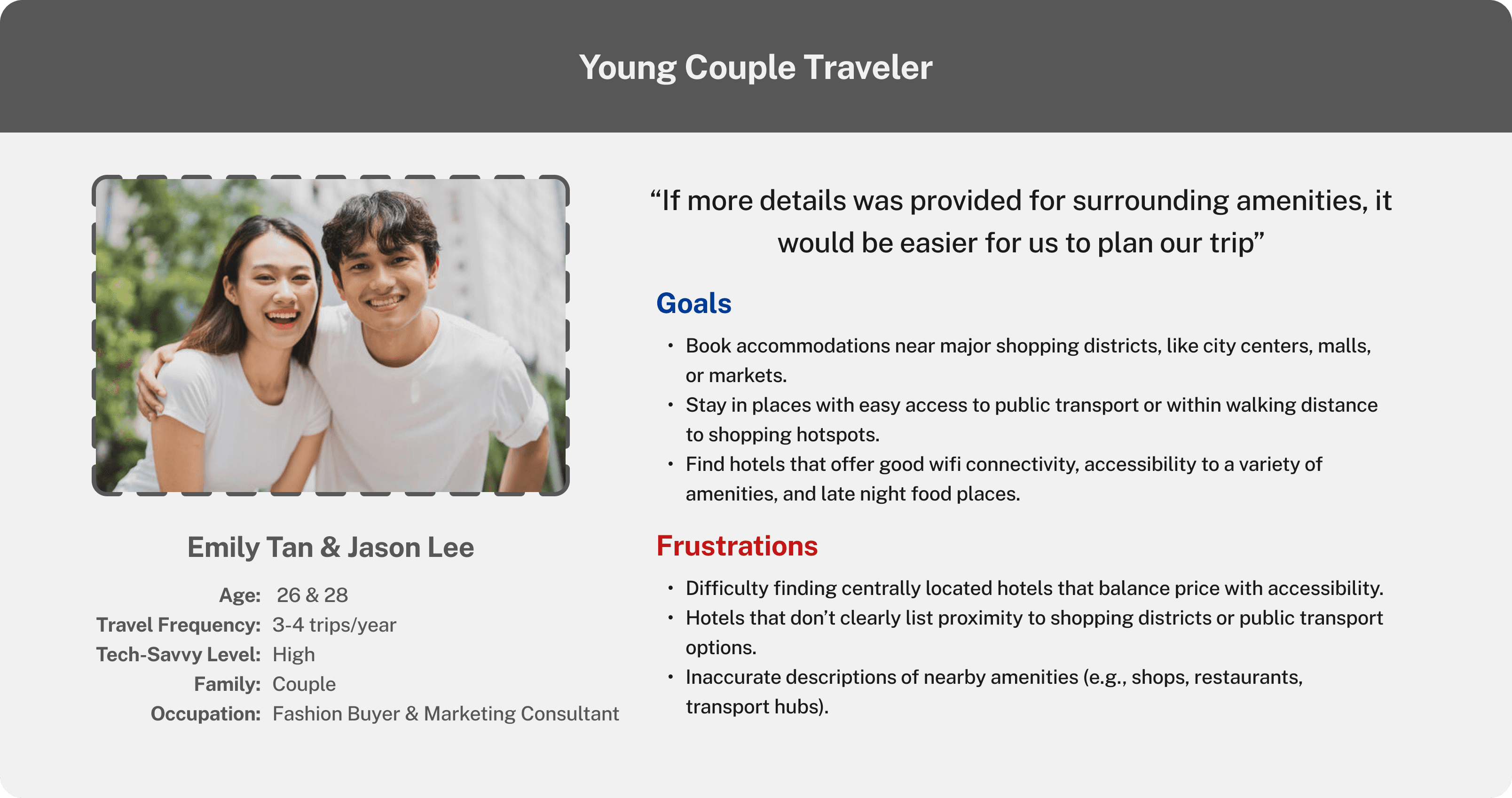
Persona 2
IDEATION PROCESS
Digital Wireframes
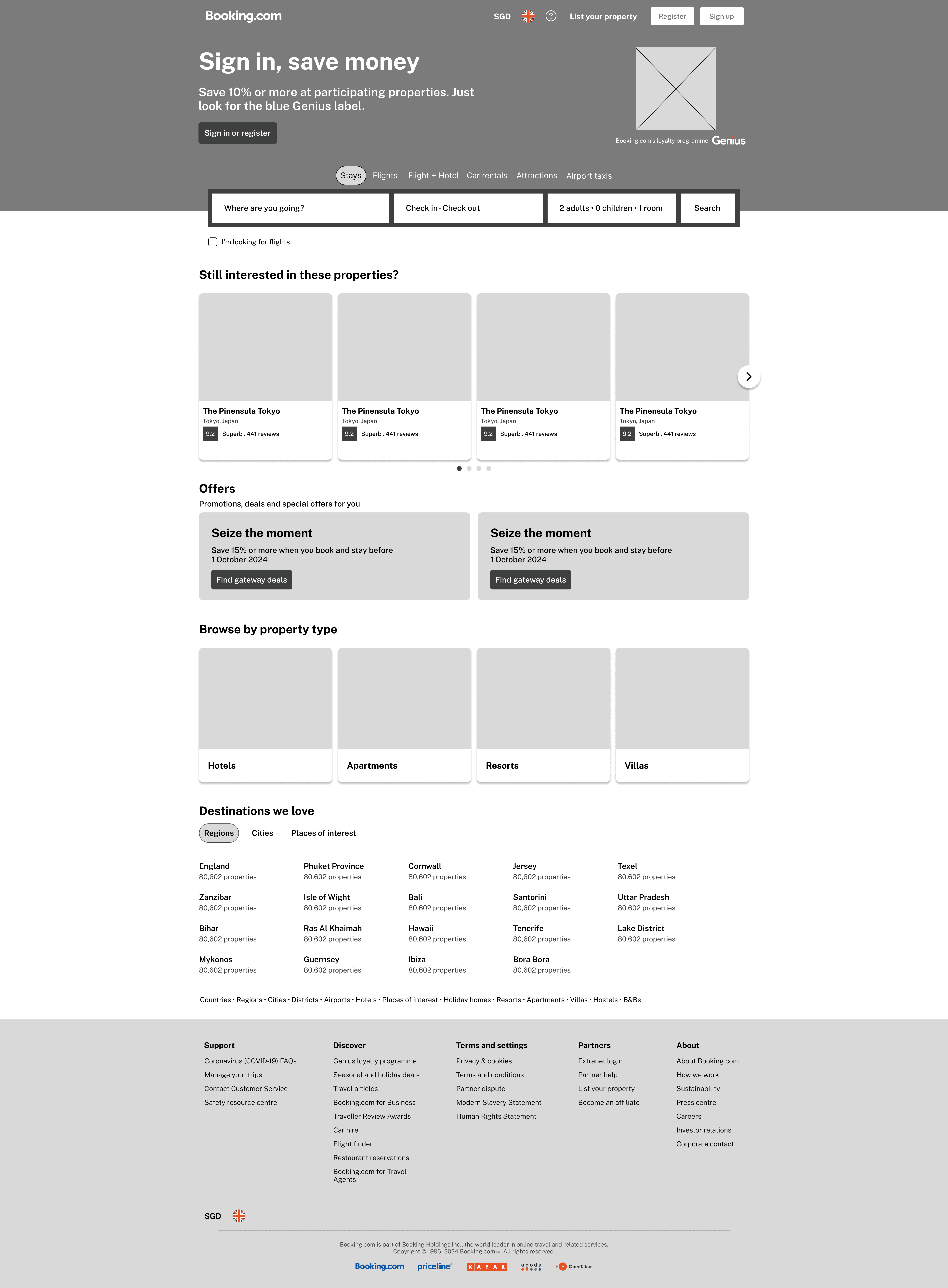
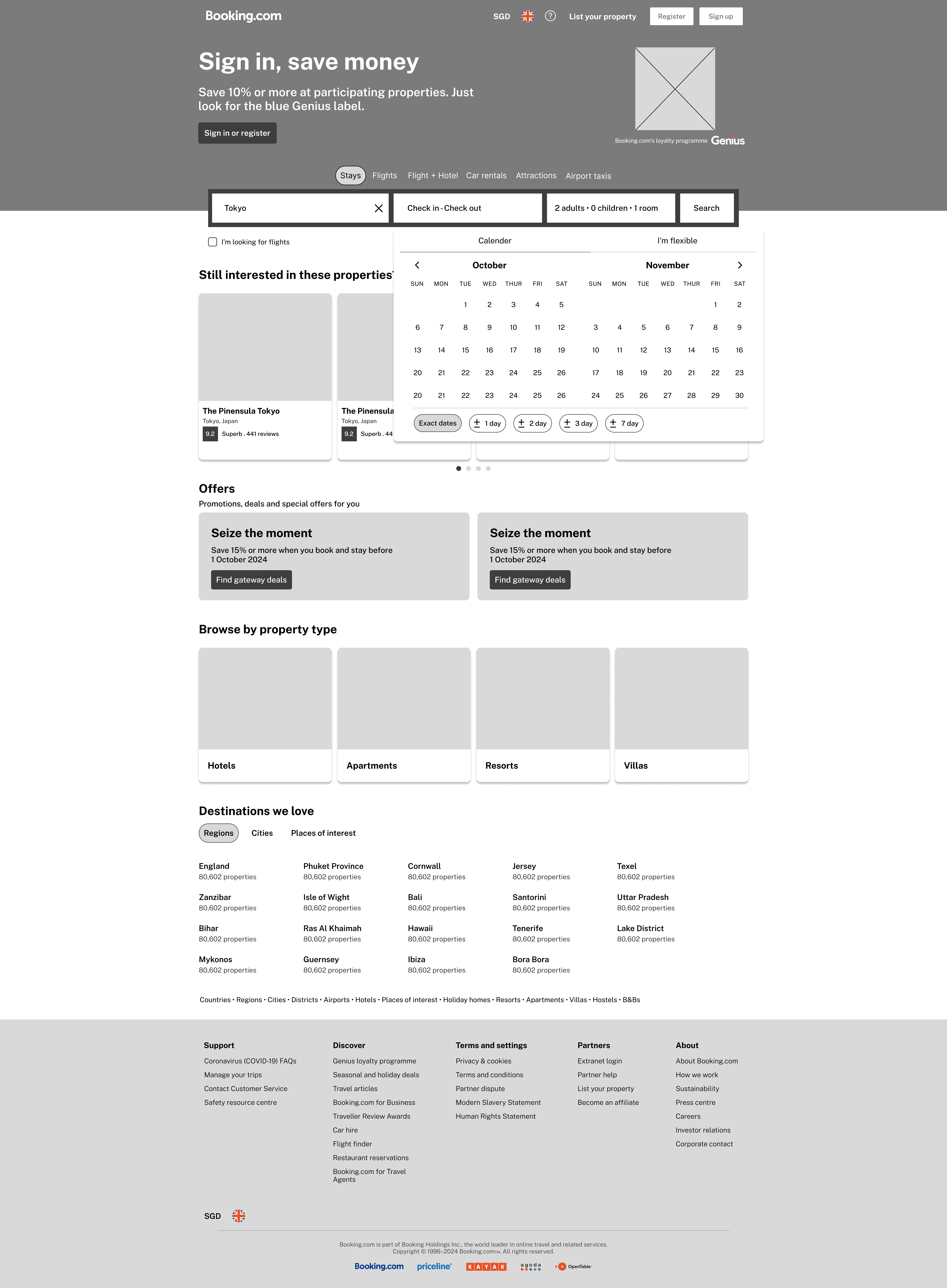
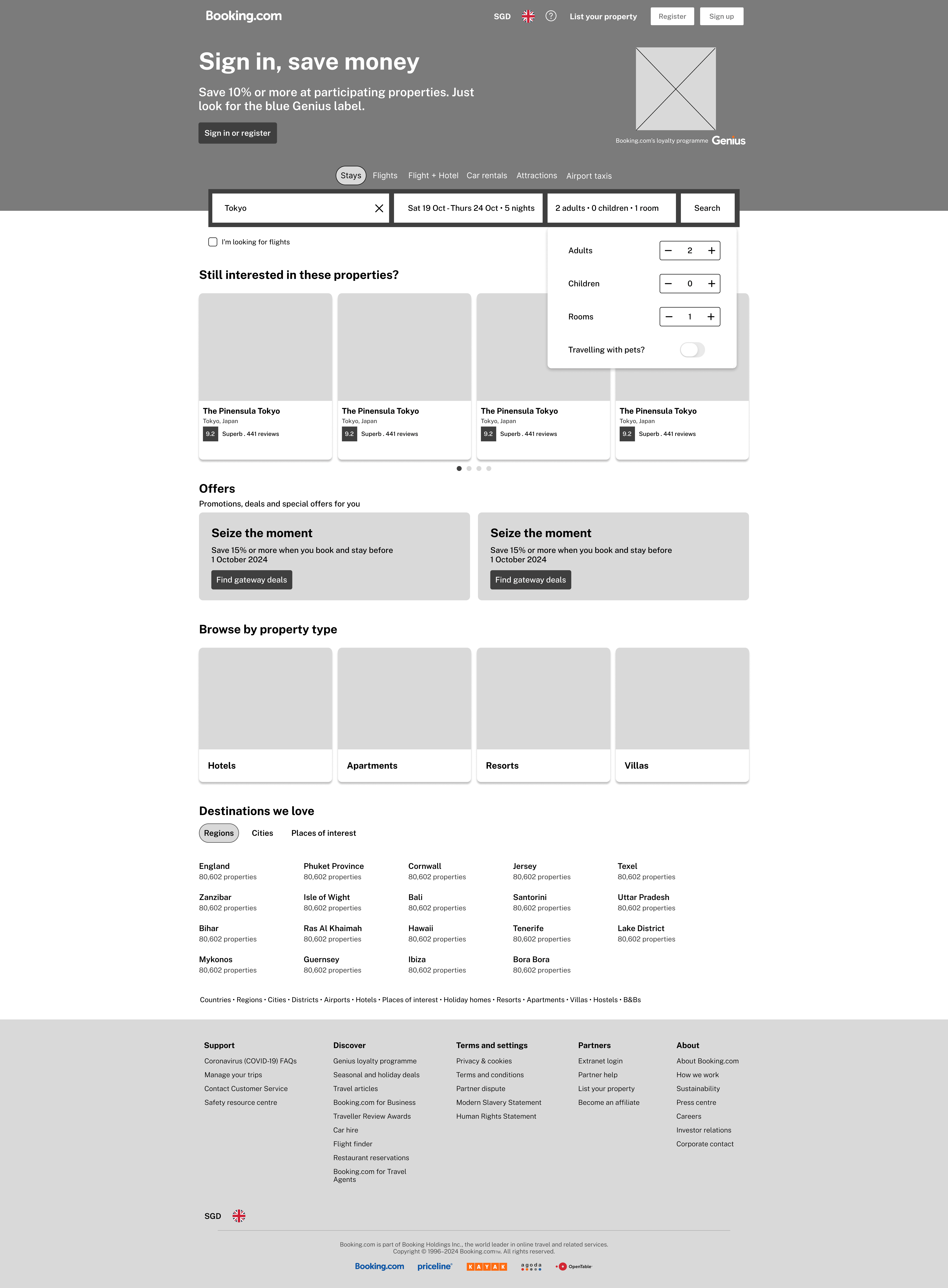
Home page
The second and third step of the search was made to pop up after selection, making it a more smooth and faster process.
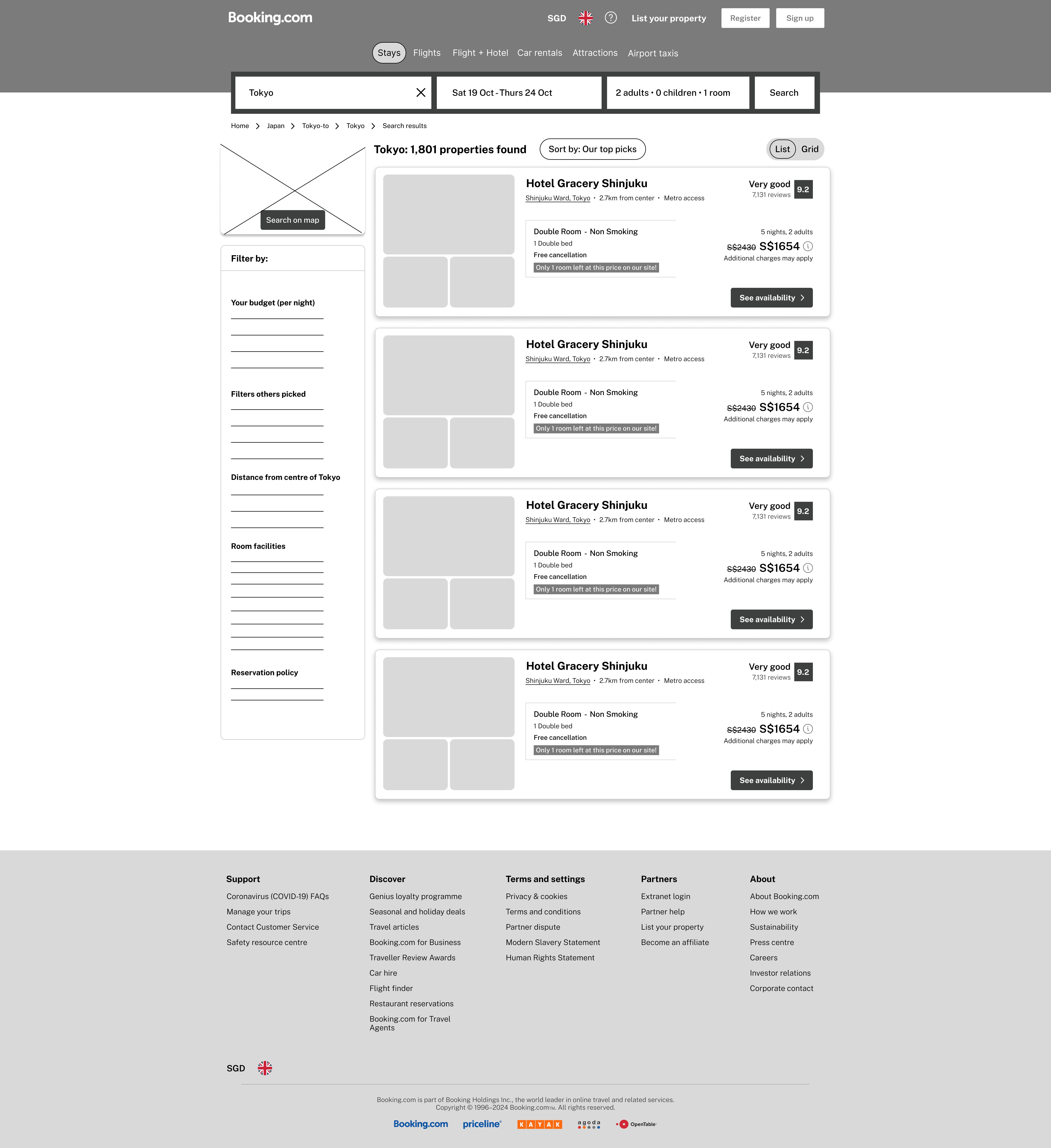
Property listings
I focused on organisation of the listing information to improve viewability for this page.
Selected property
The main focus was re-formatting the room availability section and making the map section stand out more.
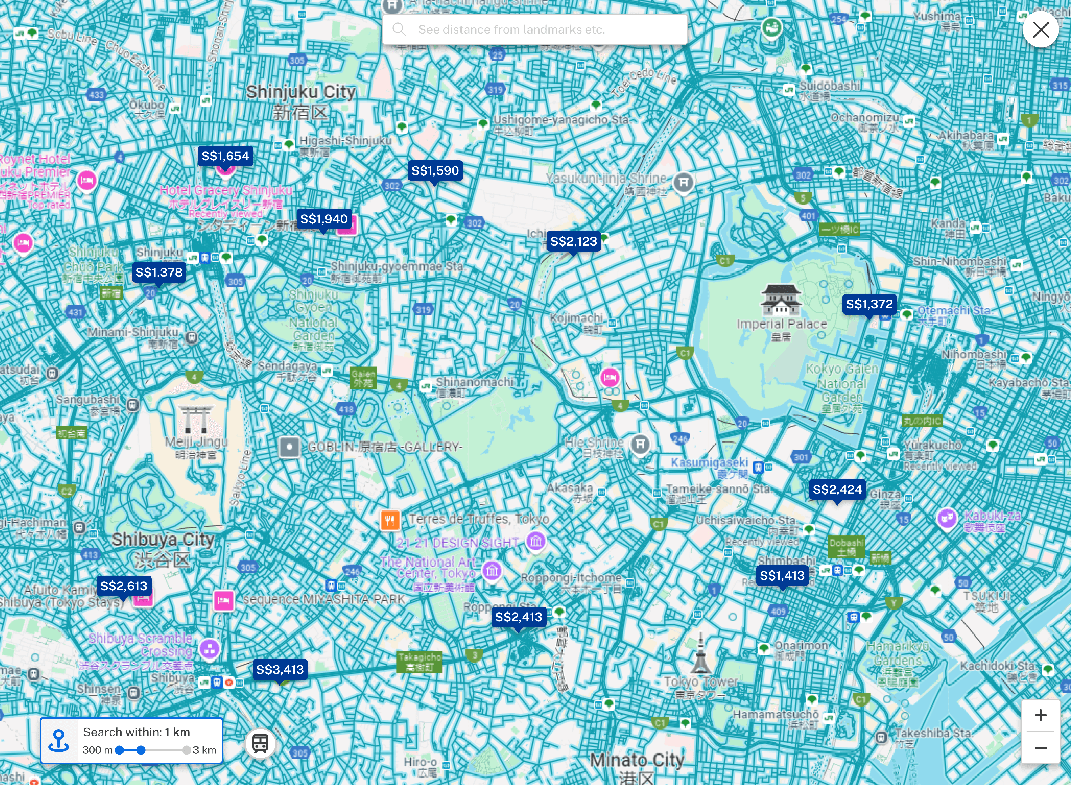
Map feature
This new addition on the selected property map provides users with more information on the surrounding amenities of the property while maintaining the ability to look for other nearby hotels.
Selected property map
Property listings map
Design Ideation
The aim was to maintain brand identity with the same main colours but enhance brightness of the overall site by adding bright colours to smaller details such as icons and important information to highlight.
Variation of grey colours were used for borders and icons to arrange information while maintaining simplicity for ease of browsing.
Front weight changes
The typography used was to be as similar as the current one as possible to retain the brand image.
The font weight for the lighter words were slightly increased to improve readability.

Design Kit
Design Components
USER TESTING
Usability Testing Round 1
Method:
Moderated usability study
Participants:
5
Time taken:
20 minutes each
Location:
Singapore
Round 1 Findings
The Solution
New Features Added
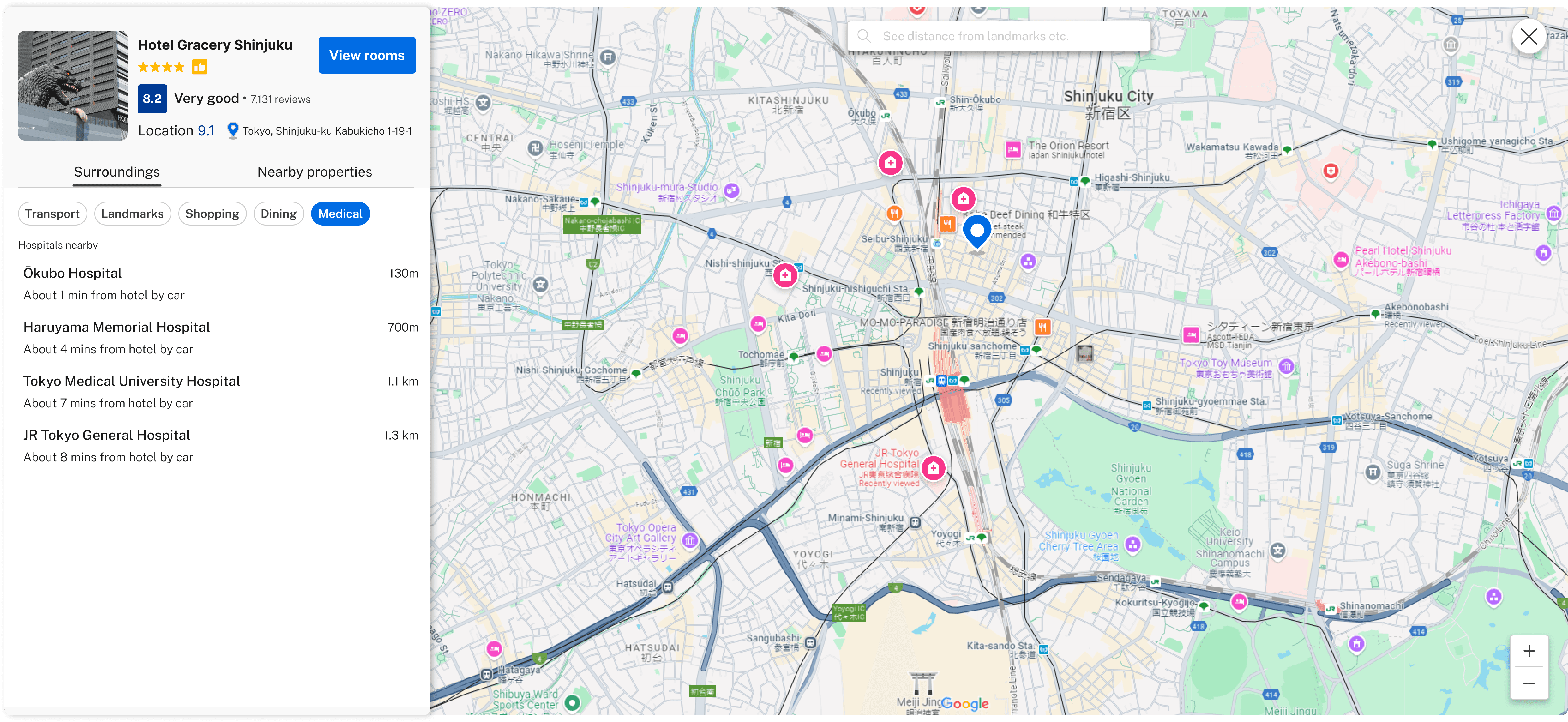
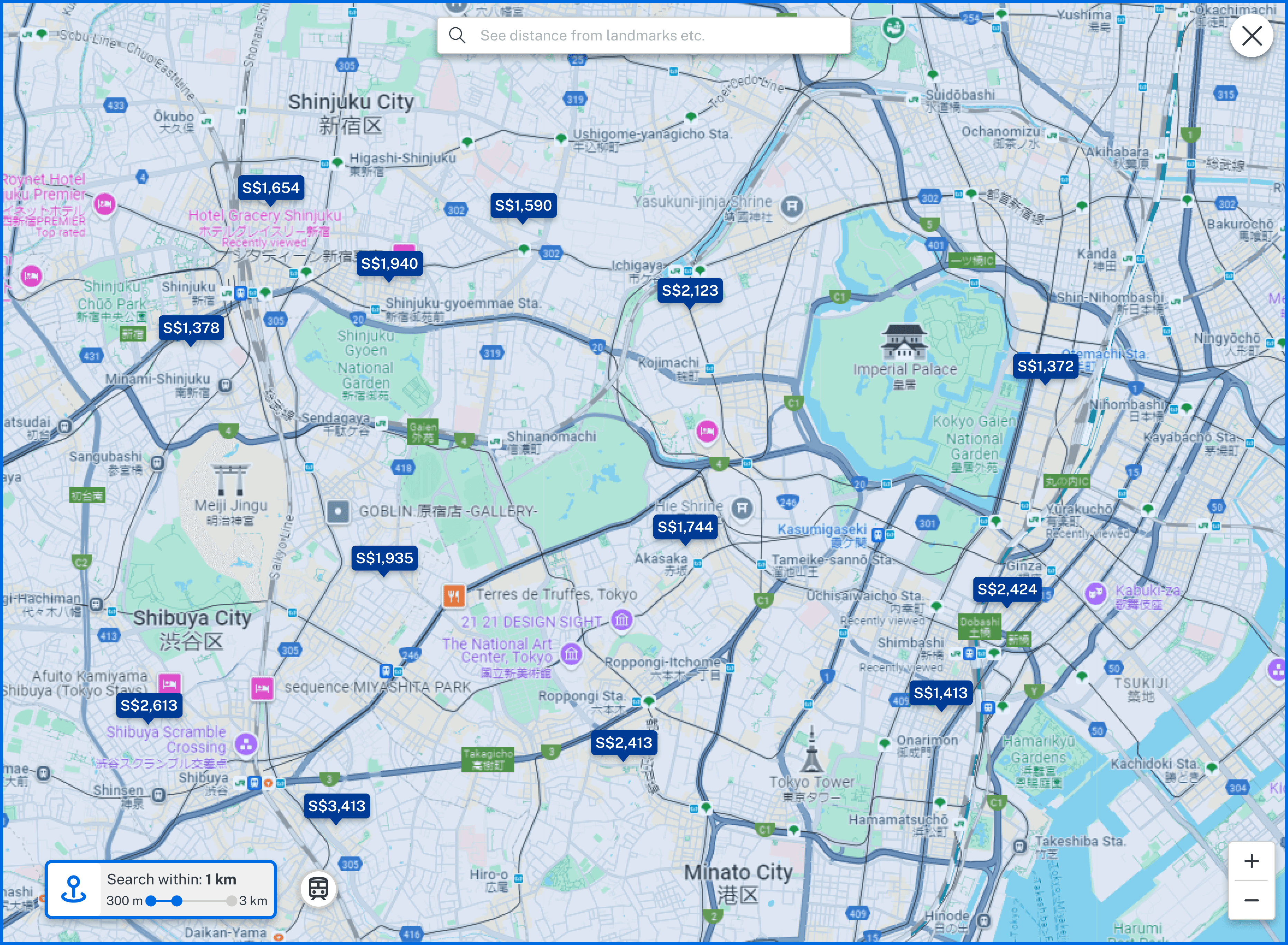
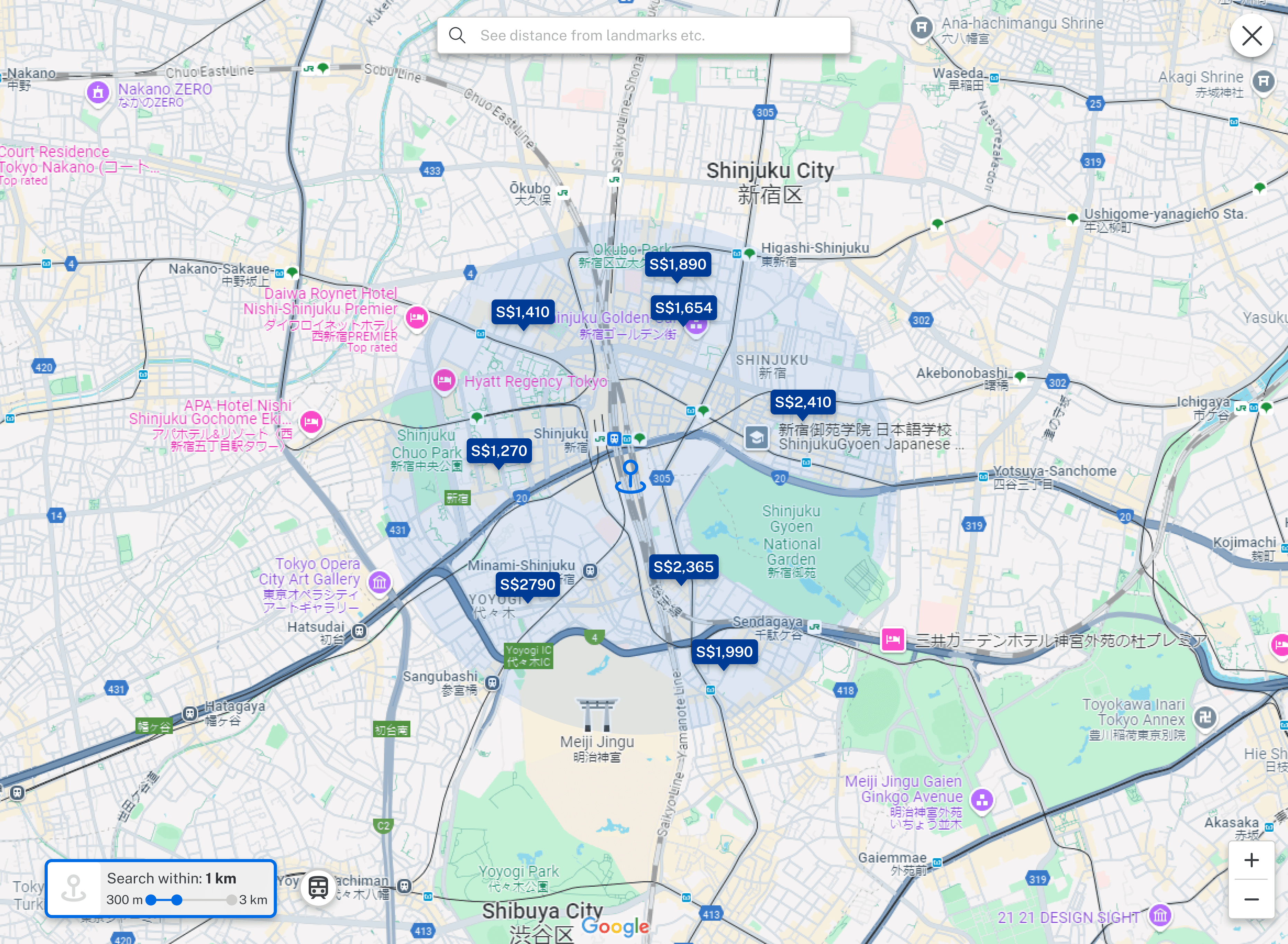
Map of Surrounding Amenities
Multiple categories of amenities added to the selected property map: This provides users more information on the surroundings of the property and help them with decision making.
Before
After
After user testing, I felt that the search map could be improved as well as it was cluttered with properties shown. I gathered feedback from users again to validate the need for improvements.
From the insights gained, I decided to enhance the search map to emphasize the benefit of using it to browse for properties. To help users save time and declutter the interface, I introduced features that streamline the search process and provide detailed information to support better decision-making.
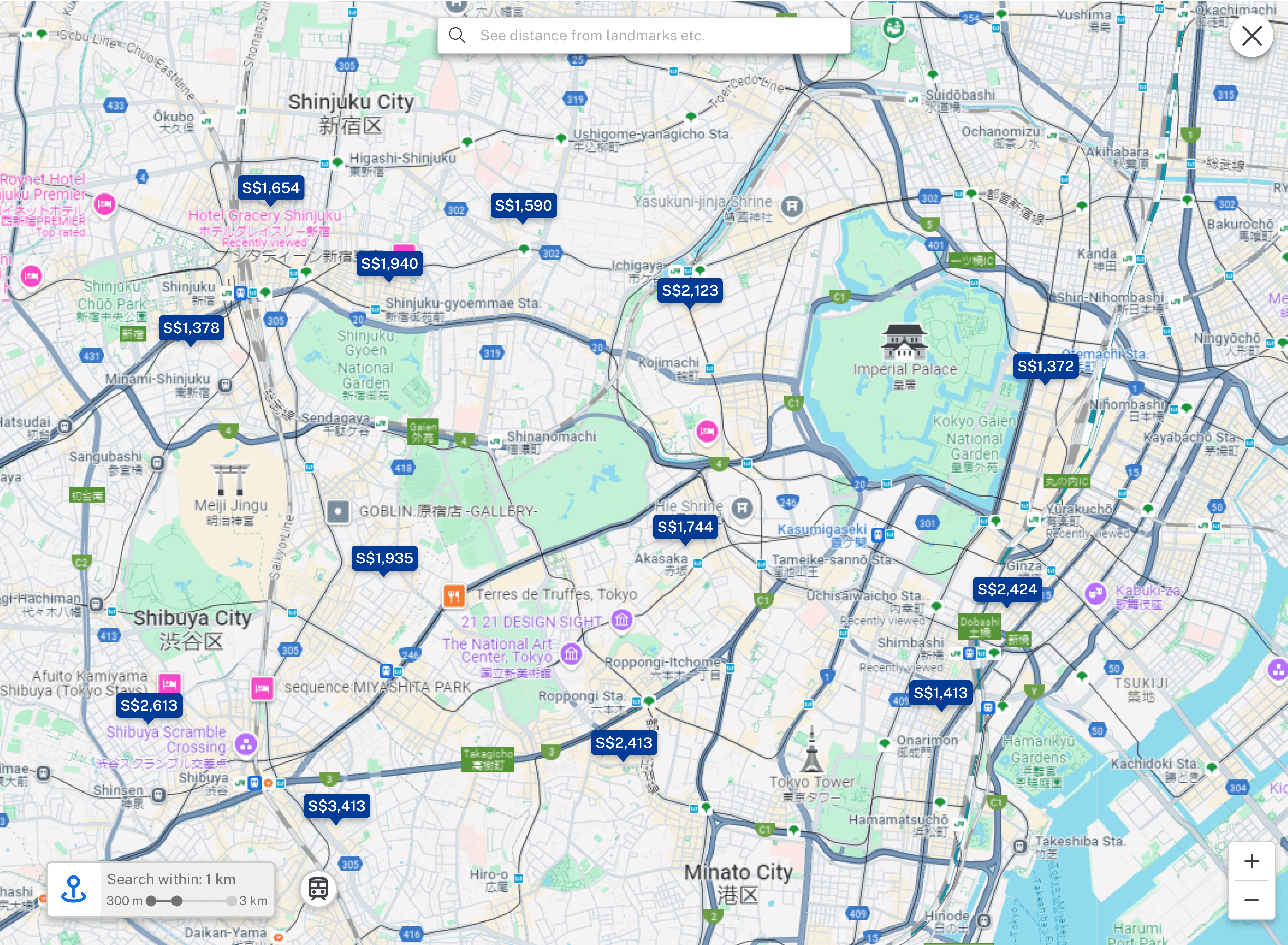
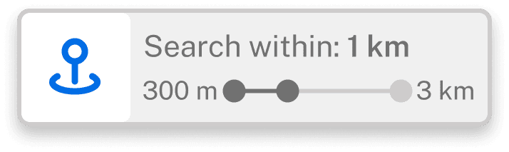
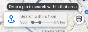
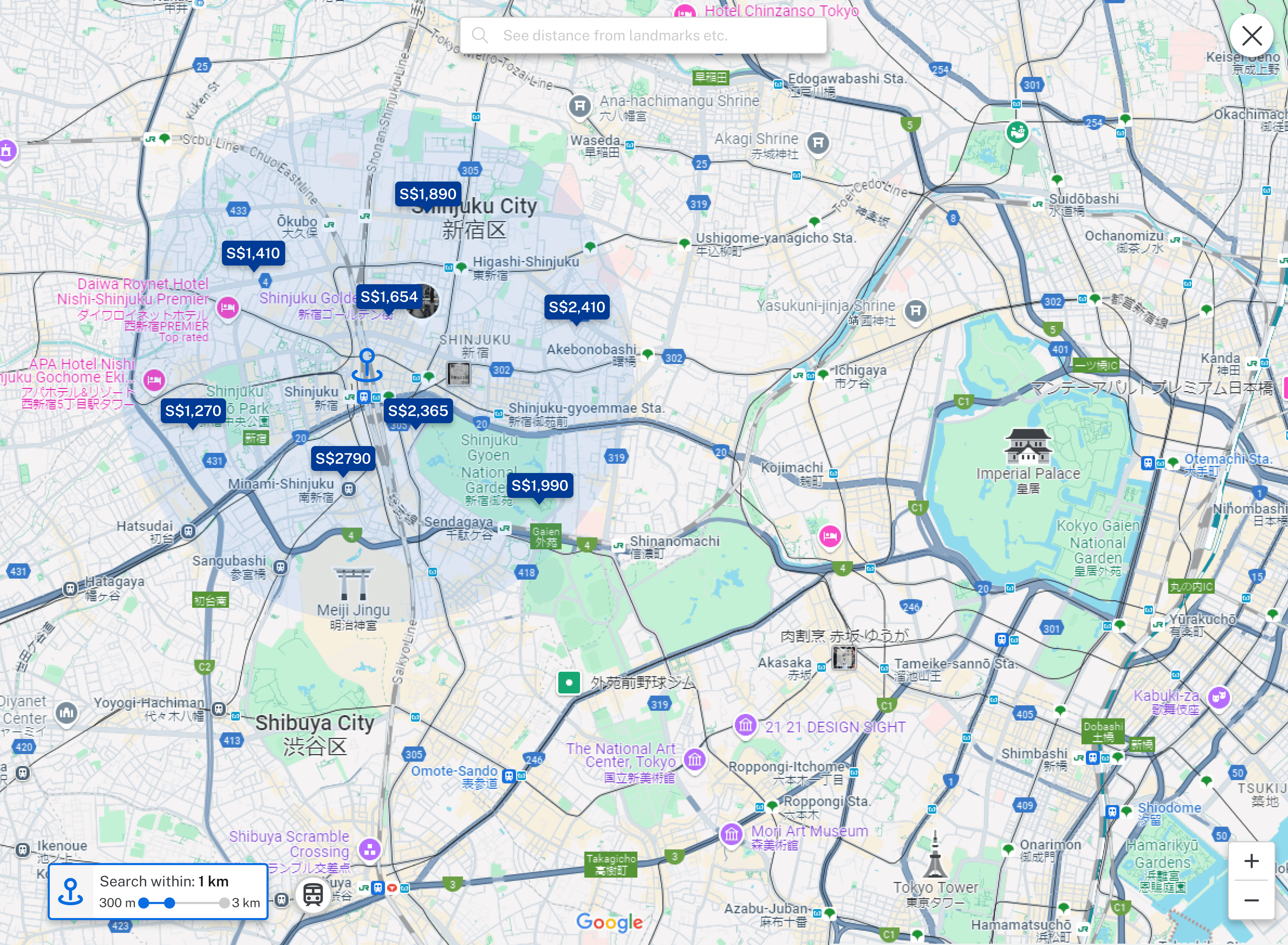
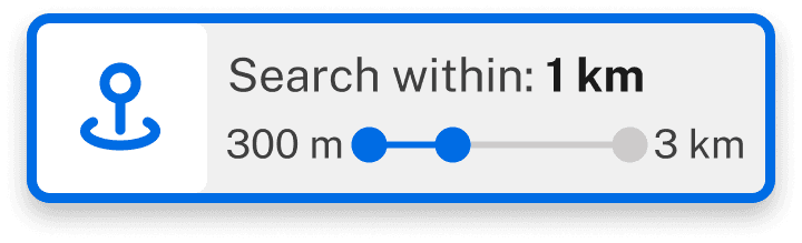
Proximity Search
To give users ability to focus their search on a single area. This can help users that are more clear on where they want to stay by filtering the options, allowing them to reduce time on browsing.
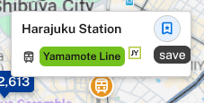
Public Transport Information
Provides information on main transportation. To benefit those who prioritize staying close to transportation and give clarity when considering various locations to stay.
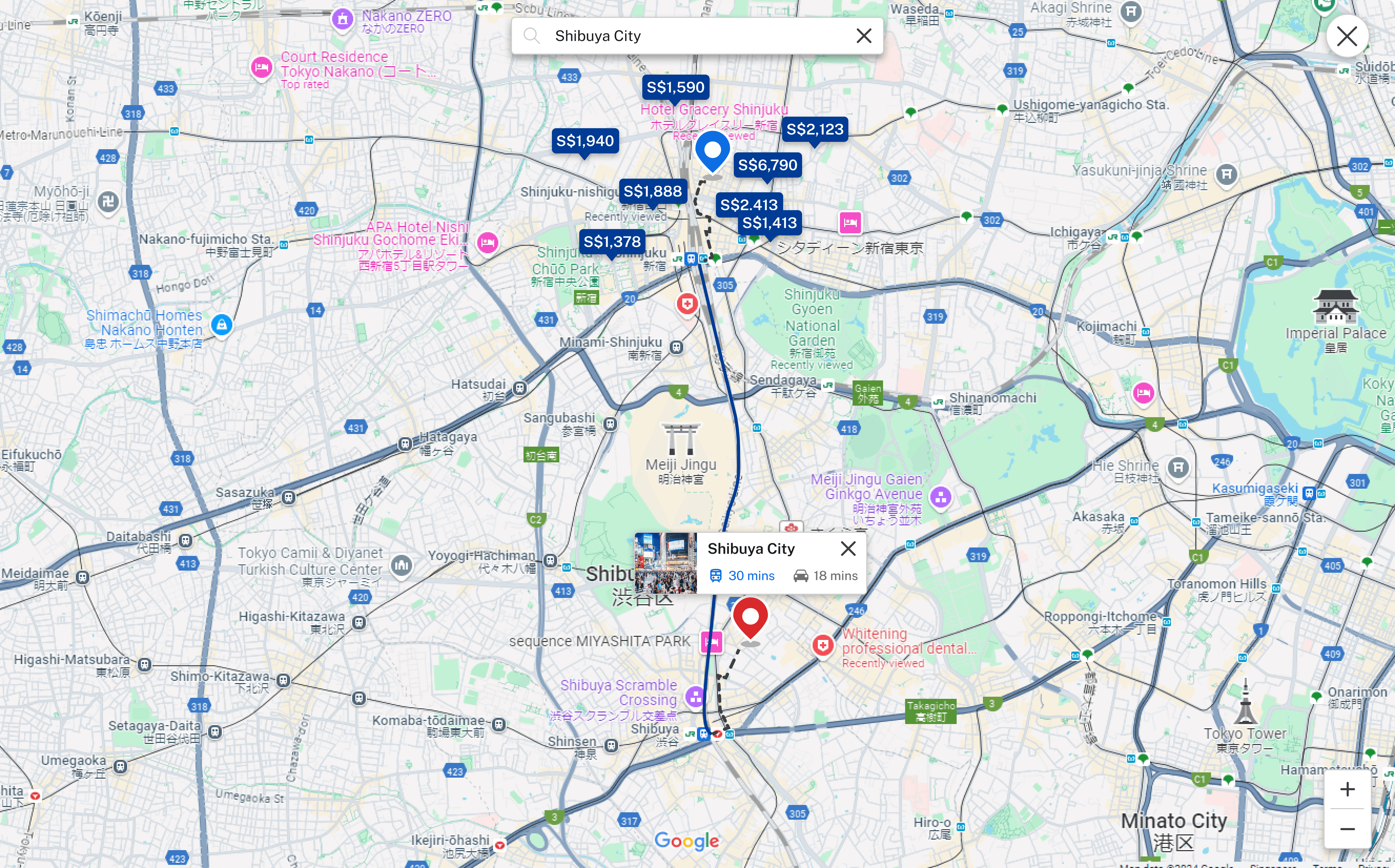
Public Transportation Timing and Routes
The search bar function to see location of landmarks now includes the ability to see public transportation and routes from selected property, providing users clearer information on travelling time to better plan their travel.
Design Iterations Round 1
1. Map surroundings updated to show multiple categories and clarity on distance.
Before
After

2. Reservation summary added to enable booking of different room types in one go and moves alongside the availability section when scrolling to maintain clarity on selected rooms.
Before
After
3. Nearby hospitals added for users who potentially need medical attention and also those that consider safety highly.
4. Map search feature enlarged to be more noticeable.
Before

After

USER TESTING
Usability Testing Round 2
A second usability test was conducted to validate the newly added features as well as the changes made from round 1.
Method:
Moderated usability study
Participants:
5
Time taken:
20 minutes each
Location:
Singapore
Round 1 Findings
Design Iterations Round 2
1. The proximity search bar has been adjusted to allow the icon button to stand out more, with the words being dimmed but still readable to give context.
Before


After
While hovering: Pop up added to help first time users
2. The activation of the proximity search is changed from highlighting the road to highlighting the whole map to make it simpler but still intuitive for users to click the map.
Before
After
3. The highlight of the proximity search bar is increased to emphasize on the activation of the function. This improves the visibility of the bar and lets users know of its de-activation method by clicking on it.
Before
After
4. The transportation save feature is changed to pin to add clarity to its function.
Before
After

5. Colour of the train route is changed to add contrast and viewability on the map.
Before
After

6. Search bar is lengthened, with the icon and words darkened to increase visibility.
Before

After

Final Designs
Booking Process
The site's navigation has been improved with enhancements to the search bar, header bar under the selected property, and room availability section. These changes allow users to browse more efficiently with lesser steps and enjoy a more seamless browsing experience.
Map Search
New features added to the map search enhance usability by allowing users to narrow down options more effectively, enabling quicker searches and better-informed decision-making.
Selected Property Map
Nearby amenities integrated into the map provide users with essential information about the selected property, enhancing their planning and decision-making process.
Impact
The changes of the map search features, navigation and user interface of the site should improve the booking experience for users. With the main focus being on the map search features, users who prefer to use this method to search will benefit largely.
It will also help provide a good experience for non-regular users and first time users, allowing them to have the option of searching for properties in another way. This should reduce the time spent on the booking process, providing users with a better booking experience.
Overall, that will result in increased user retention and user base, benefiting the brand in the long run.
What I Learned
Constant re-iteration and research
Even when designs have been finalised and rolled out into the website, constant testing and research is necessary to ensure the designs are benefiting the user and business. A good design is one where improvements are always being made.
New ideas
Initial ideas are not always in the final design. When evaluating feedback and brainstorming for solutions, I should be open to new and unknown ideas so that there’s a possibility of improving beyond the normal standard.